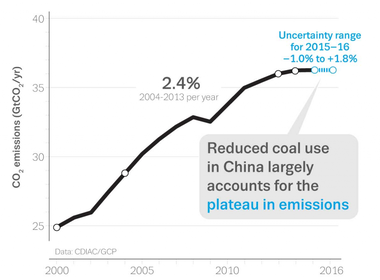
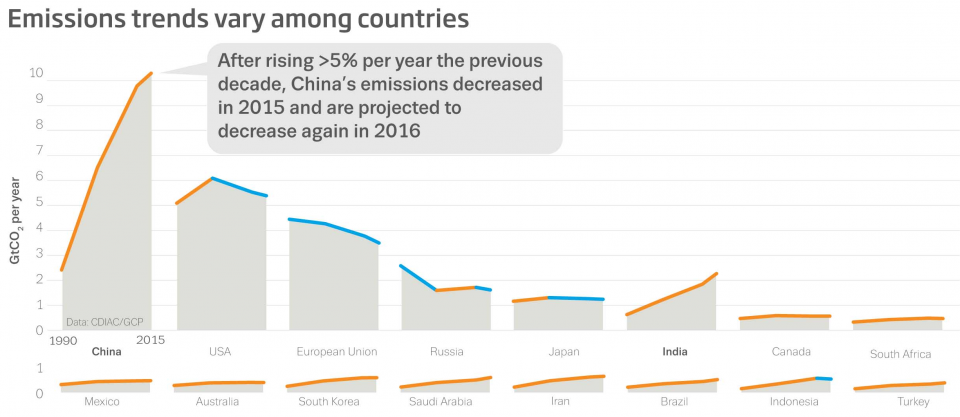
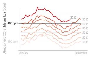
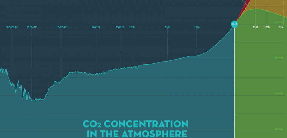
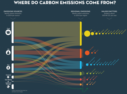
 Global carbon emissions topping out Global carbon emissions topping out I LOVE LOVE LOVE the work that the Global Carbon Project is doing to help us understand the problem of carbon dioxide emissions. It’s a heavily nuanced problem, without direct causality that is relatable to everyone. That’s why there’s such disagreement on this issue — many people need to see it with their own eyes to believe something. And that’s impossible to do to everyone’s satisfaction with this issue. Great News – Peak Emissions This story should be front page news … that humans have gone 4 years with largely flat carbon emissions. This shows the progress we’ve made in the early response to the crisis. Switches worldwide from coal to natural gas played a large part in this progress, and economics were thankfully on the side of carbon reduction during this period — natural gas prices were historically low. Before climate change skeptics seize on this and spin my post to serve their ends, realize this: global carbon concentration will continue increasing until we cut emissions to near zero. We have much work left to do, but can take short-term solace in our progress to turn the graph back down. China Progressing; US, Russia, Europe, Japan Leading, India Problematic This chart shows the last 25 years of emissions by country, and clearly shows the leadership of the developed world on reducing emissions, even Putin’s Russia. China has turned concave down, but India is still concave up, with accelerating emissions. Add up the other developing countries and they are a significant part of the problem to manage, politics aside. Are We There Yet? NO! This next chart shows carbon dioxide concentrations at the Mauna Loa measurement station in Hawaii, chosen for its remote location and ability to measure global trends rather than national ones. From 2010-2016, carbon concentrations have increased from 390 ppm to 400+, and each year the level has stayed elevated above the prior year, showing a clear trend. And the historical argument that many have made is shown back to 100,000 BC. This chart shows natural variation, but a clear departure around 1950, as we humans outstripped the planet’s ability to process our waste. And going forward from 2015, the chart shows various scenarios of human activity and their effect on carbon concentration. I have clipped the graphic here to show only the best case scenario, in which people are able to get together and bring down carbon emissions to near zero. Where’s it Come From?
This final chart shows the source and location of global carbon emissions in a spectacular display of complex information… so go ahead and digest all this… it’s a lot to process. But it’s an under-publicized story that should be discussed at every dinner table and bar and water cooler.
1 Comment
|
Author Nick Brown, CEA Archives
May 2017
Categories |
Proudly powered by Weebly

 RSS Feed